
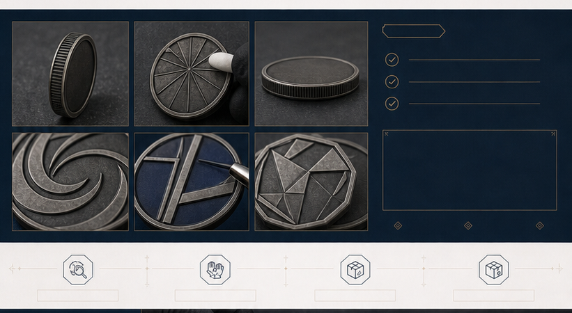
Metal plating color options for custom coins affect contrast, relief, perceived weight, and the way a design fits a recognition program or retail collection. Gold, silver, black, copper, polished, brushed, and antique directions can make the same zinc alloy coin look like a different product. The best choice depends on the artwork, base material, raised and recessed areas, enamel, engraving, packaging, quantity, and intended use.
This guide is for brands, organizations, military and service groups, schools, clubs, event teams, retailers, and wholesale buyers comparing a custom coin finish. Zincustomized reviews the product brief, artwork, finish, proof, sampling needs, inspection points, and packaging requirements before the quotation is finalized.
What a plating color changes
A plating direction changes the visual relationship between high points and low points. A bright surface may reflect more light and emphasize clean borders. A darker or antique treatment may keep more contrast in recessed backgrounds. A copper or warm metallic direction can change the tone of a commemorative or brand design. The result is not determined by the color name alone; polishing, relief, engraving, enamel, lighting, and the underlying metal all contribute to the appearance.
When sending artwork, mark which areas should remain bright, which areas should retain darker contrast, and which areas should receive enamel or another color fill. If you are referring to an existing product, identify whether the reference shows plating, polishing, color, relief, or packaging. This prevents a supplier from treating a photograph as an exact technical specification.
Gold plating for formal or warm visual directions
Gold plating is often considered for awards, anniversaries, commemorative coins, premium gifts, corporate recognition, and designs that need a warm metallic tone. It can work with dark enamel, strong outlines, and restrained relief. A gold direction may also be used as one version in a medal or recognition series, but the artwork should clearly identify what changes between versions.
Gold should be reviewed with the finished coin size and the selected enamel. Fine lettering may have less contrast against a bright surface than expected. Pale colors can blend into a light metallic field if the border is too narrow. Ask for the proposed gold direction in the proof or sample, and avoid presenting a plating color as proof of a particular precious-metal value unless the project specification expressly supports that claim.
Silver plating for neutral and institutional designs
Silver is a versatile direction for challenge coins, commemorative pieces, clubs, companies, schools, and institutional programs. It can support cool brand palettes, clean logos, and designs where the metal itself should remain visually neutral. A brighter silver direction can look reflective, while a softer or antique silver direction can emphasize relief with more contrast.
Compare silver with the background fields and enamel colors. A pale blue or white color may need a stronger metal border or darker recessed field to stay readable. A proof should show the relationship between the raised emblem, lettering, edge, and background rather than showing the plating as an isolated swatch.
Black plating for strong contrast
Black plating can create a darker, modern, tactical, or industrial direction for coins and metal products. It may work with bright polished relief, selected enamel, or a simple emblem with strong lines. The design should be reviewed for readability because dark metal can reduce contrast when the artwork also contains dark color areas or small text.
State whether the raised areas should remain bright or receive the same dark direction. The desired contrast may require selective polishing, different surface treatment, or a carefully planned recessed background. Confirm the approved appearance with a physical reference when the finish is important to a launch, ceremony, or repeat collection.
Copper plating for warmth and heritage
Copper plating can add a warm tone to commemorative coins, club products, historical themes, anniversary pieces, and designs that need a less conventional metallic direction. It should be compared with the artwork, enamel, edge treatment, and packaging because a warm surface can change how brand colors are perceived.
For repeat orders, keep the finish name, approved sample, relief, polishing instruction, and enamel colors in the same project record. “Copper” is not enough if the team needs to reproduce a particular contrast between raised and recessed areas later.
Antique finishes for recessed contrast
An antique finish is often selected when the buyer wants darker recessed areas and a classic, heritage, or commemorative appearance. It can help raised wording and symbols stand out when the relief is suitable. Antique does not mean that every area will be uniformly dark. The visible effect depends on the treatment of high points, low points, polishing, plating, and the geometry of the design.
Ask which surfaces will be highlighted and which areas will keep the darker contrast. If the design includes small lines, fine lettering, or several enamel fields, review a proof at the intended size. The antique finish guide and challenge coin finish guide can help organize those questions.
Polished, brushed, and selective surface treatments
Polished areas can create reflection and make raised metal feel more prominent. Brushed or softer textures can reduce reflection and support a less glossy appearance. Selective polishing or contrast can separate the emblem from the background when the design requires a controlled hierarchy. These directions should be described with the product geometry, not chosen only from a color list.
Include surface treatment in the artwork brief and ask for it to appear in the proof. A digital mockup helps communicate intent, but a physical sample is more useful when the buyer needs to judge reflection, texture, weight, edge feel, or packaging.
Compare finish with relief, enamel, and edge design
Plating is connected to the rest of the coin. A 2D relief may suit a clean logo and simple border. A 3D relief may create more variation between high and low surfaces. Engraving depends on line clarity and contrast. Enamel adds color fields that need enough metal border. Plain, reeded, rope, textured, or engraved edges create additional visual and tactile information.
When comparing quotations, provide the same diameter, thickness, relief, edge, material, plating, enamel, engraving, quantity, packaging, inspection, and delivery assumptions. A unit price without a complete specification is difficult to evaluate. Confirm whether tooling, proofing, sampling, packaging, and shipping are included or separate.
How Zincustomized approaches finish approval
Zincustomized connects finish decisions with artwork review, material selection, relief, enamel, engraving, attachment or presentation, packaging, quantity, and intended use. Our production discussions cover zinc alloy, stainless steel, copper, plating, enamel, and related custom metal routes. We use the available brief and proof to identify questions that should be answered before production.
We do not present screen color as a physical guarantee, and we do not invent certifications, customer counts, client logos, or guaranteed outcomes. The buyer remains responsible for artwork authorization and final approval. A physical sample or approved production reference is the practical way to evaluate the intended appearance when the finish is commercially important.
Finish approval checklist
- Choose the base material, coin diameter, thickness, relief, and edge.
- State the plating color and which surfaces should be bright, dark, polished, brushed, or antique.
- Confirm enamel colors, engraving, lettering, and the smallest important detail.
- Confirm packaging, quantity, sample needs, inspection, destination, and target date.
- Save the approved proof, finish reference, sample notes, and reorder specification.
Frequently asked questions
Which plating color is best for custom coins?
There is no universal best option. Choose gold, silver, black, copper, polished, or antique according to the artwork, recognition context, desired contrast, handling, packaging, and budget.
Does antique plating make every recessed area dark?
The result depends on the design and surface treatment. Ask the manufacturer to show how raised and recessed areas will be handled in the proof or sample.
Is gold plating always more expensive than silver?
Not necessarily. Total cost also depends on size, material, quantity, relief, artwork, tooling, packaging, sampling, and delivery assumptions. Compare complete specifications.
How do I request a finish comparison?
Send the coin artwork, preferred size, quantity, finish directions, packaging, destination, and target date through the quote request page, WhatsApp, or email Liam.
Related custom coin routes
Continue with the Custom Coins product page, challenge coin hub, Challenge Coin Size Guide, or custom metal plating overview.
Choose plating by use, contrast, and presentation
Gold, silver, copper, black, and antique finishes create different visual relationships with raised metal and recessed areas. Bright plating emphasizes reflectivity; antique treatment increases contrast in recessed details; black plating creates a darker technical or modern appearance. The best choice depends on the artwork, the intended lighting, handling, and whether the product is displayed, worn, or distributed as a recognition item.
For approval, request finish references or a physical sample when color perception matters. Digital images are useful for direction, but screens and lighting can change how a metallic surface appears. Zincustomized reviews plating together with base material, relief, polishing, and color fill rather than treating color as an isolated decision.
Compare plating colors with the artwork and use case
Metallic colors do not behave like flat digital swatches. Gold, silver, copper, black, and antique treatments reflect light differently, and the appearance changes again when the surface includes raised relief, polished areas, recessed texture, or enamel. Review the finish with the actual artwork and intended product size. A color that looks balanced on a screen may become too low-contrast when the coin is viewed across a room, or too bright when it is handled close up.
Consider the use case before choosing a finish. Presentation coins may benefit from a bright or contrast-rich treatment. A club or school coin may need a friendly color relationship that keeps the emblem legible. A brand or corporate recognition coin may call for restrained contrast and a finish that works with existing packaging. If the product is frequently handled, discuss realistic wear expectations and storage rather than promising a surface that never changes.
Finish comparison questions
- Should raised metal be bright while recessed detail stays darker?
- Will the coin be displayed, worn, carried, or packed against other metal products?
- Does the artwork need a warm, cool, dark, or high-contrast direction?
- Are color-fill areas being reviewed separately from the metal plating?
- Can the finish be compared using a physical sample or supplier reference?
For a multi-finish design, label the front, reverse, edge, and special areas separately in the artwork. Include the base material, polishing direction, plating name, color-fill references, quantity, packaging, and delivery destination in the quotation request. A clear specification gives the factory a practical basis for proofing and gives the buyer a fair basis for comparing quotations.
Zincustomized coordinates casting, relief, polishing, plating, color filling, inspection, and packing. Compare this article with the custom metal plating and finishes page and the metal plating specification guide, then request a project quotation or start a WhatsApp conversation.